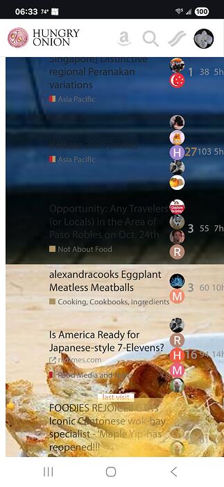
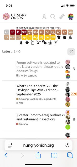
The forum software is updated to the latest version tonight. If you run into any oddities/ bugs, please report here.
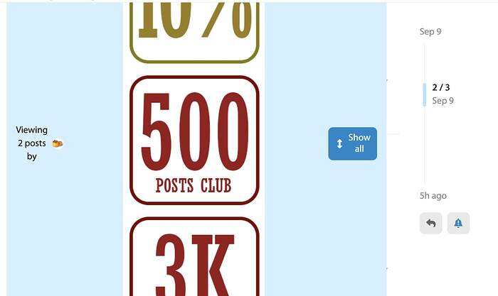
When I click on my avatar/icon at the top of a thread to filter comments, there’s a bug – instead of showing the filtered comments, it shows badges.
Same as sunshine
iPhone 12 mini. iOS 18.5
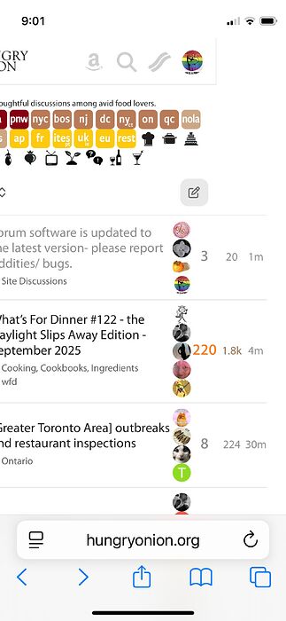
But befor I scroll down to where the images are behind the text - the alignment is off and the data causes a right scroll
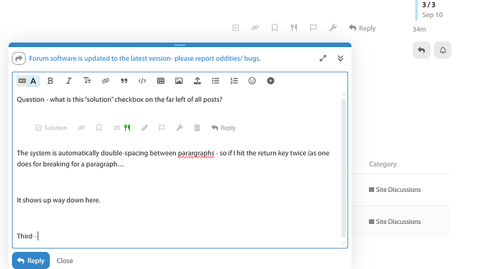
Question - what is this “solution” checkbox on the far left of all posts?

The system is automatically double-spacing between paragraphs - so if I hit the return key twice (as one does for breaking for a paragraph…
It shows up way down here. (Not sure if it will show that way once I hit the Reply button, but it’s frustrating as it adds additional spacing where its not needed.) ETA: Ok, it removes the additional spacing. So if I only hit the Return ONCE…
How does it look now? ETA: Same thing. So the system is automatically removing double spacing as we Olds were taught years ago. Bleah. Still hate that we’ have to scroll more with a smaller reply box.
Third - the size of the reply box has shrunk - it used to go over near the scroll bar, but it’s much boxier now.
Before the update it would ignore double or even triple spacing, and only ever leave one line between paragraphs.
Concur with the boxy reply box.
The German term for updates of most any kind is “Verschlimmbesserung.” ![]()
I call it “usually unnecessary but done to make sure the developers keep their jobs.”
Thanks. It’s the topic thumbnail that’s causing trouble. It used to only display for desktop but now for mobile as well. I disabled it for now so mobile topic list displays properly, until we find a fix to the thumbnails.
Since the software is open source and we have used the software free for ten years, I am just grateful for the generosity of the developers. ![]()
You can select the original reply box by clicking the upper left icon in the reply toolbar.
For the rest, does it mean you solved them? Please let me know if there are still issues.
Can you show me where you are clicking?
I get it. ![]() Free is good. I just don’t want the Discourse boards to go the way CH did 10 years ago.
Free is good. I just don’t want the Discourse boards to go the way CH did 10 years ago.
I just highlighted the quoted section and clicked the arrow here:
Got the same view. The either reply box is smaller (Windows desktop at work).
The software told me to update my browser, but I didn’t and there were no issues. I just stuck my tongue out at the message and clicked through it. (LOL) For the record, I’m using Firefox.
The formatting is a little different, but it all appears to be working just fine.
Nah. They got plenty of their paying enterprise customers ready to yell at them if they ever do such a thing.
Confirming that it’s resolved for me.
after reading a topic to the last post, when you got to number of unread topics it used to update in real time to remove the topic you just read. now that number is always one more than what you find when you click on the link to unread topics.
Can’t add a picture to a post on my iPhone. When I click on the usual icon I get something that says div data theme slick= 1
Can’t add a picture to a post on my iPhone.
Trying that on my old Samsung Galaxy 9. Nope, seems to work.
I’ve deleted my HO bookmark and re-loaded HO to my home screen. Still getting the same issue. FWIW, the reply screen is unusually big.
