Font looks very blurry today for some reason. Was there a change to the font?
Yes. It looks like this to me. how did it look to you? what browser/ OS are you using?

Looks fine to me.
No change for me, laptop or phone
I use Firefox and a Firefox “clone” (K-Meleon). On Firefox, the black Regions text looks over-bolded. On K-Meleon, the blue topic headers text is jaggedy. Your screenshot and both of mine look blurry to me, to be honest.
I’ve seen these sorts of font changes on other sites before and someone once told me it’s because the latest tablets, phones, and high-res laptops display these fonts better. These modern fonts make my head hurt a little so I immediately noticed the change. But then CG graphics in TV programs and movies makes my head hurt, too, so I’m probably in the super minority.
FF:
KM:

1 Like
Mine is blurry on my ipad - safari
https://d3ibra4y67nfc2.cloudfront.net/original/2X/9/99e2ccfc49e4c1639b0414a5fd06d2e4be347bdf.png
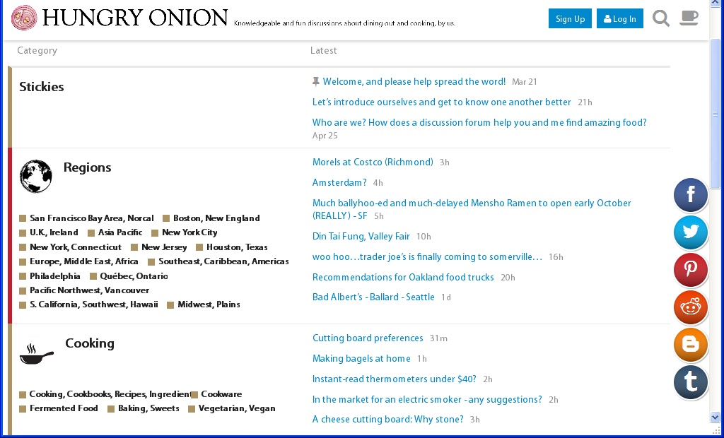
How come I don’t have those region/category icons at the top of my screen (below the HO logo)? I’m on Chrome right now, but they don’t appear in Safari either (on my iPad at home).
For me, I noticed what I thought was a point size change in the font - it’s either 1 or 2 points smaller than how it previously rendered - at least here on my work PC - I’ll check at home tonight. I’ve had to click the Zoom up to 110% so I can read it appropriately. Because I’m an old.
1 Like
Change everything back or I’m going to Chowhound!
I’d say not to waste too much time on it. I’m only one user and I can deal with it. My software skills/intuitions are from 15 years ago and I’m desperately clinging to those, for various reasons.
I am curious, though: Was the font change was something you planned yourself, or was it forced through a forum software update?
2 Likes
OK, at home on my laptop, the font size seems to be the same as before at 100% viewing. So I’m not sure what’s going on.
The ‘new’ font was implemented for 2, 3 months a while back, before something broke and the default font came back. I just fixed the situation.
I added a few more font format for compatibility purpose. take a look and see if it looks any better. Firefox tends to render fonts a lot more ‘bold’ than intended. Chrome/ IE/ Safari seems to be more natural. @Lindawhit I also made the text a little larger.
@winecountrygirl On an old Ipad 2 where the resolution is lower, yes the font looks a bit low resolution. with newer iphone/ ipad it looks tack sharp. think it has more to do with how high of resolution the screen is.
for the toolbar- yeah, I think I need to fix the toolbar code as there is some error. My Firefox shows it fine. My Chrome doesn’t seem to like it.
1 Like
Looks less jaggedy for me today. Thanks. You kids with all your newfangled fonts.
2 Likes
@hungryonion, I was viewing @ 110% when I came in to HO this afternoon, and thought it all looked larger. Set it back to 100%, and its readability is now good. Appreciate the fix!
Didn’t want to start a new thread but did anyone else just get a major change to the site? The “latest” page now has much larger summaries (and a different design) so that I only get two threads per page on my phone. Miss the old design.
I briefly played with the settings yesterday night. But end up didnt change anything. You may need to just refresh your page.

