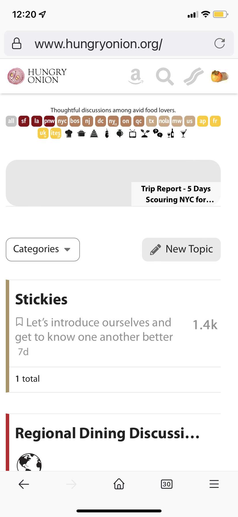
Not a fan of the new regional discussion buttons look. The all-lower case is harder to read than all caps, especially at that size (can you see the little “ct” in the corner of the ny button?), and the white type almost disappears behind the yellow background.
As well, the text at the top has now shrunk — at least on my iphone screen.
Makes it even harder to read
Also, @hungryonion is there an adjustment possible in the background for what font size “small, large, largest” actually uses? I had switched to largest on my phone, which was legible, but after the update the font for largest is pretty similar to what small used to be, and the others are even tinier.
Thanks
ETA: here’s a screenshot of the homepage from my phone to illustrate the shrunken category button sizes, and the font size otherwise for “largest”
I’ve been trying to figure out what the color range of the regional categories buttons reminds me of. It looks like a color chart/range for face makeup - weird! Did you do that deliberately? Maybe a set of rainbow colors would look more appealing? Thanks.