What was the old restaurant design power color? The article mentions “baby blue” and “navy,” but those aren’t especially common, at least not that I’ve noticed.
Why am I even talking about this? What the hell do I care what color a restaurant is?


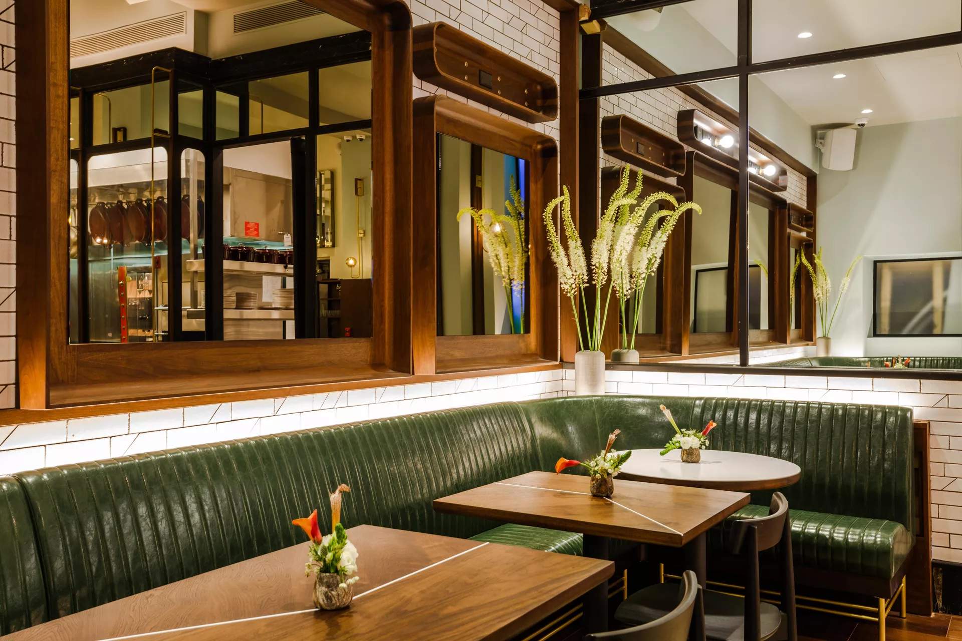
That looks like avocado green in the photo, not emerald. Not a fan.
They could make it all lime green with orange trim for all I care, so long as they reduce the noise.
and keep it clean !!!
I thought orange and yellow make you hungry; is that debunked?
It was always my understanding that the color green was simply soothing to the senses. But according to this it seems that the color green encompasses just about everything else in life.
Green , the color of life, renewal, nature, and energy, is associated with meanings of growth, harmony, freshness, safety, fertility, and environment. Green is also traditionally associated with money, finances, banking, ambition, greed, jealousy, and wall street.
I think “blue” is the “generally soothing” color…
It always amazes me that this psychomarketing stuff actually “works” on people, but I guess it does, or at least it does on a statistically significant number of people, a statistically significant amount of time? (Further evidence that PT Barnum knew whereof he spoke…) Or maybe some people just think it does??
Dunno what it says about me, but if I found myself feeling unusually “soothed” just walking into a business of any sort, or much hungrier than I was before I stepped across the threshold of a restaurant without, say, smelling delicious food smells, I think I’d start wondering what they were pumping into the ventilation system, and would be slightly concerned…![]()
Or Eater thinks it is, anyway…![]() /
/![]()
I was going to say the same thing!
Some type of study was done years ago and it was decided that green was the most soothing color. They said that’s why hospital waiting rooms were painted pale green and I don’t remember what else. Surprised me at the time because green is one of my least favorite colors. That particular finding just always stuck with me.
Prison walls are green for the so called calming effects.
Yup.
Trendy new Asheville cafe:


The decor is actually very pleasant in person.
Which incidentally is a good example of another restaurant design trend, floral/plant wallpaper: https://www.eater.com/2018/5/30/17376522/tropical-wallpaper-pattern-flower-cactus-anthropologie-etsy-interior-design-tips
Aside from what looks like green marbleized wallpaper, this displays as aqua/teal to me. Is it green IRL?
Yup
Actually, I just went back today, and you’re right: the wainscoting and cabinetry are teal and the wallpaper is emerald green and teal.
Actually there’s a bright apple green color that will be a big color trend for womenswear probably for resort/prespring of 2020.
I once read that color trends emerge about two years to a year and a half our first with interior design, then can be seen in menswear before emerging in womenswear and then accessories.
Interesting because this is the same timing, the restaurants being fairly recent and we’re about a year from seeing it for womens.

