not to digress too far back to the original question, but . . .
thanks for the leads/links.
in my cursory searches I have seen what I considered not really trustable sources cite numbers ranging from 7 to 13 . . .
not to digress too far back to the original question, but . . .
thanks for the leads/links.
in my cursory searches I have seen what I considered not really trustable sources cite numbers ranging from 7 to 13 . . .
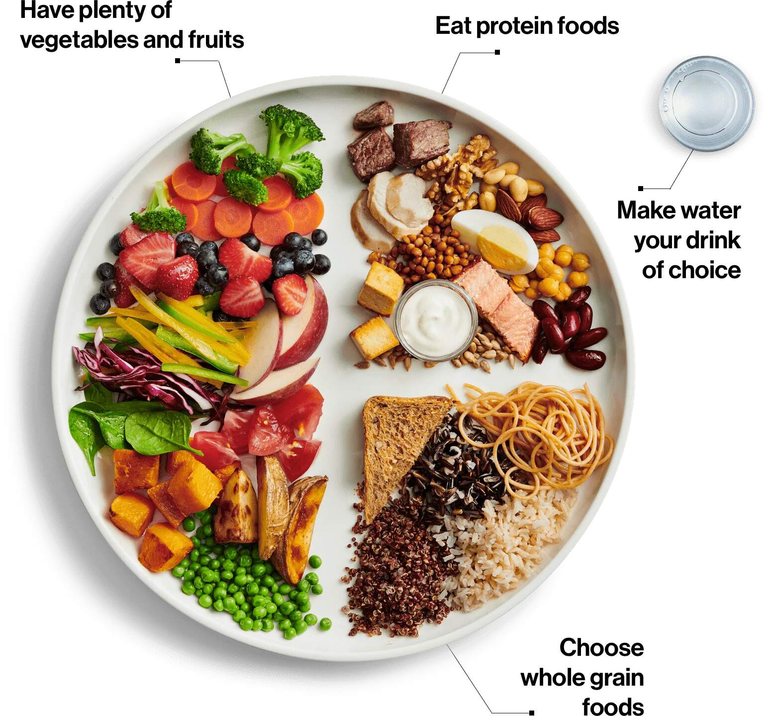
This is the Canadian food guide, to compare and contrast.
Very nice.
Thanks for sharing. Interestingly, the U.S. had retired the food pyramid representation in 2011. My Plate (link to Wikipedia) had been in effect before the new guidelines were issued in 2026. My Plate looked a lot more like Canada’s guide, which seems very sensible and does a great job of communicating information at a glance.
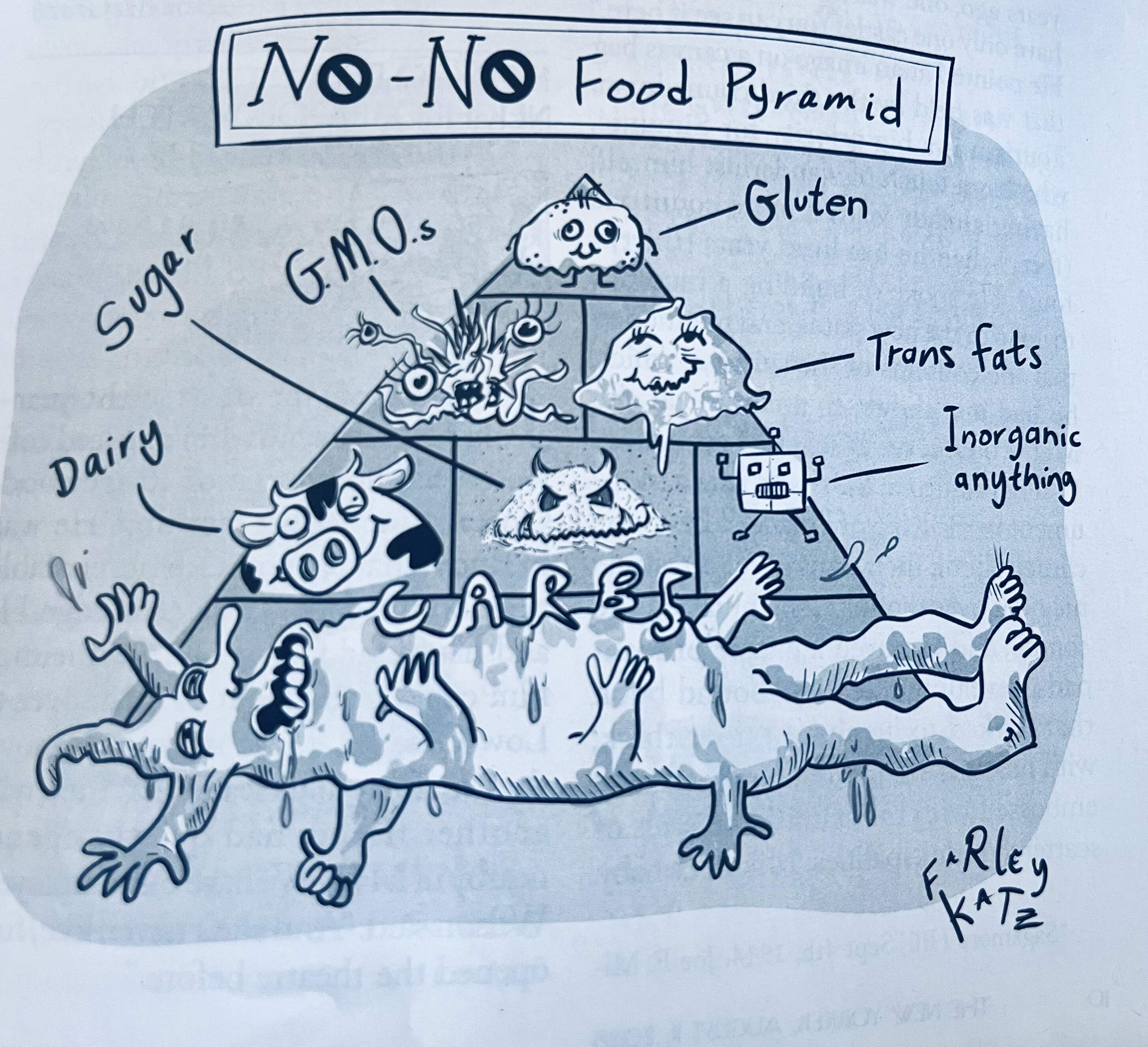
The problem with the traditional pyramid (e.g., pointy end up) was that what is on top are the things one should eat the least of, yet positioning them at the top implies they are better than lower levels. One thing that RJK did right (from a communications standpoint) was to invert the pyramid. You may disagree with what the recommendations are (I certainly do), but at least he has the items that he most recommends in the biggest section and at the top, implying precedence.
perhaps a pyramid is not the best graphic to represent a diet. mine tends to resemble a small hub in the middle (the stomach) with spokes radiating out representing the various foods i eat. the more spokes in the wheel, the better my diet seems to be. if you want to get fancy, use colored spoke covers (like we use to do on our bicycles when we were kids) to categorize different things.
No doubt this administration will pump millions into the public school lunch programs to help implement their own guidelines. /s
New U.S. dietary guideline: If you can pick it up at a drive-thru, you probably shouldn’t eat it.
Except not new ![]()